
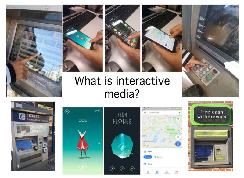
Interactive media is…
Media which involves the user or audience. It allows the user to input and “actively participate” so that it can respond and interact with what the user’s actions.
Examples of non-Interactive media:
Examples of Interactive media:
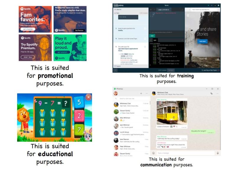
Examples of…
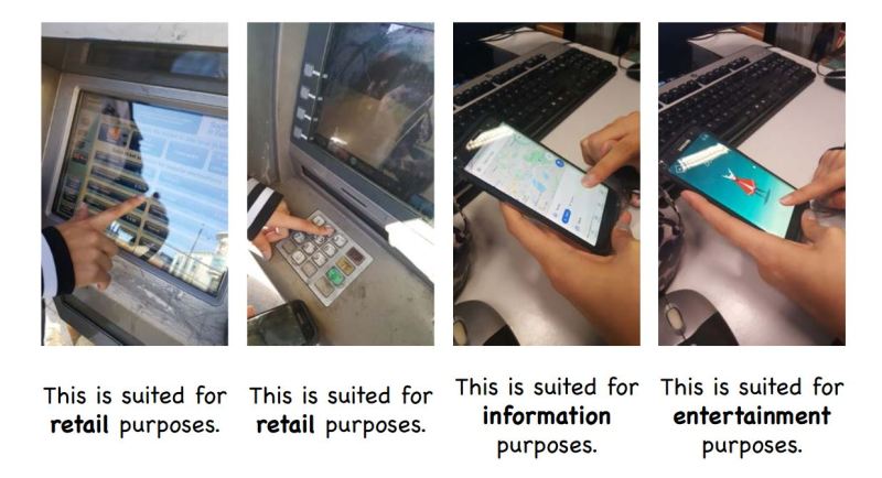
Screen-based interactive media:
Projector-based interactive media:
Web-based interactive media:
• Video games
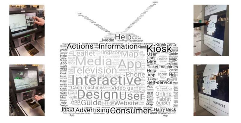
Interactive media is made to suit the needs of a variety of clients.
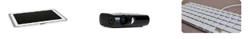
In order to make Interactive media, you need to have the right equipment suited for what type of Interactive media you are making.


What is copyright?
What are terms and conditions?
A privacy policy is…
Data is collected by…
What is a cookie?
What is material design?

You can gain inspiration from other designer’s work by analysing why it works and looks good

Learning the process of material design can help a designer produce work efficiently

Understanding what looks attractive to the viewer and getting the main, simple idea across is the objective of the designer. Having layouts which mathematically work will make the viewer naturally drawn towards the designer’s work

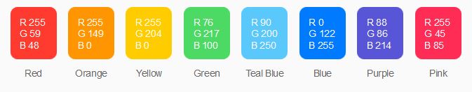
This shows the material design of a file organisation page. The colour palette is bold purples which work well with a range from black to white as both colours can be seen alongside the purple. The font size and typography of the header, title and subtitle can also be seen, and they are all numbers which are relative towards each other
Privacy Policy and Terms and Conditions for Material Design
It is important to remember the privacy policies and terms and conditions of material design so that you know how your information is stored and used, and if there is a breach of the terms and conditions there could be consequences.
Material Design (material.io) is owned by Google and so it comes under Google’s privacy policy with how they handle the user’s information. Google allows the user to make their browsing private as well as able to control and change their privacy settings anytime, this allows trust to be built between Google and the user so that the user will be more inclined to use their services and products.
Google collects some information about the user to improve their own services to make it appeal to more people, as well as improve the quality for its per-existing users. The information which is collected depends on the user’s privacy controls and how they use Google’s products or services.
The terms and conditions of Material Design also come under Google’s “terms of service”. By using Google’s services, the user is agreeing to the terms and conditions set by Google. This includes rules such as:
- Not misusing the services (like hacking into it or doing something illegal on it)
- Not using the services when it could interfere with traffic laws (such as using it whilst driving)
- You do not own the services you are using as it is already owned by Google, such as their branding logos or other intellectual property rights
- Some content displayed by the service may not be owned by Google, and so they could have their own copyright rules, privacy policy and more
Designing Apple’s iOS
An Apple product such as an iPhone or iPad is capable of running applications which can help, entertain and display information for the user – but it must be thought of, designed and developed by someone first.
Layout
If someone wants to design an app for an Apple product, it first must be optimised to suit the many layouts, screen resolutions and sizes that an iPhone or iPad can have. Due to the nature and design of some apps, they may only be created for solely an iPhone or iPad as the layout is not optimised for both.

To maximise the amount of users who will download or pay for an app, it is useful to optimise it for a lot of variations of the Apple products, as some apps may also not work on devices with outdated system updates, which can also limit the amount of users of an Apple product which can use the app.
Apple gives a guideline to designers who want to create an app. Using “auto-layout” will allow the designer to define the rules for their app which will make it a lot easier to optimise for a lot of screen sizes, resolutions and devices.

Animation
It is recommended by Apple to make animations clean and simple. Having excess animations for an app will not only be unnecessary, but it could slow the app down or make it annoying to use. A consistent animation, for example whenever a button is held there will be a slight wiggle of the button, will help the user understand what is going on in the app as well. Consistency in the animation helps the app flow a lot better and makes it nice to use.

Branding
Relating back more to Material Design, it is important for a designer to think about how their app will relate to their brand, and what will make it recognisable. Colour, familiar logos and images as well as typography and font can help with the branding of an app.
Despite branding being an important part of making an app recognisable, it is just as important to not let that get in the way of good app design which makes the app easy to use, navigate and has good content. Consistent branding is good, but not when it interferes with the app’s quality.

An example of an app’s branding
Colour
Apple recommends referring to their current system’s colour scheme if a designer is looking for a balance between their app and it’s platform, an Apple product. This allows for the app’s colours to be harmonious and complementary of each other, which makes the app’s design flow a lot better with its platform.
This colour scheme has been formulated to look good on both light and dark backgrounds.
The design of Apple’s current iOS is that of being sleek, simple, effective, vibrant and clean, and so when an app matches these themes it will already be off to a good start in terms of design.
Colours can help to communicate and call attention to specific information. If this is used sparingly, it can become very effective inside an app. Subtlety using colour can further help with the branding of an app. Apple recommends colours which compliment each other rather than contrast, so that it is not distracting to the user.
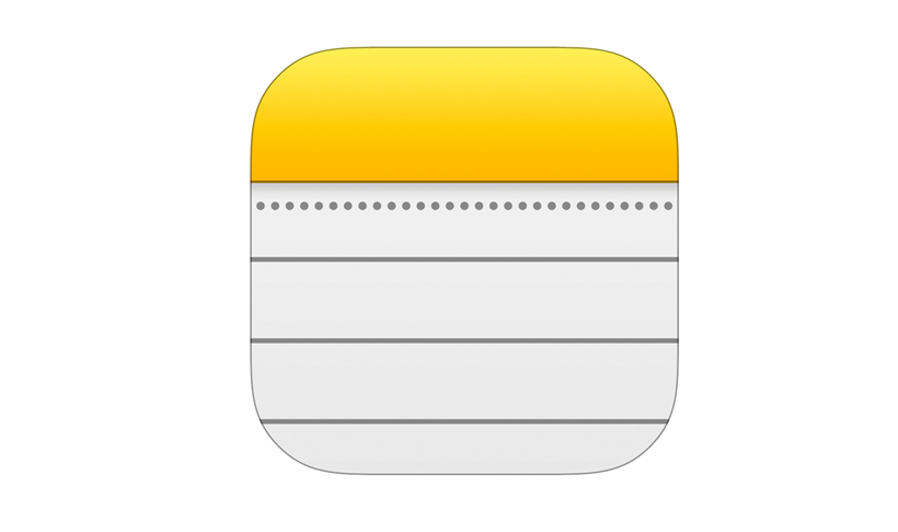
If the designer chooses a colour to “represent” the app (such as the yellow colour for Notes, or Red for calendar) then this should remain a continuous theme for the interactive elements of the app to avoid confusion on where the user can tap.
Apple also recommends the designer to consider the lighting of where the user is using the app. Do the colours work well when the device is being used inside and outside? Are they visible? Some apps opt for a pastel colour scheme when creating their design, but this must remain visible depending on the user’s environment otherwise it will limit when and where they can use the app.
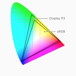
The Apple iOS uses the standard RGB colour space and so it is important that apps have been designed to match this (otherwise the design will be different colours than intended when displayed on a device).
Terminology
Making the language inside an app familiar and casual to the user can intimidate them less and become more comfortable with using the app. Having understandable phrases and words will allow the user to feel like they can understand the app more and it will not be as much of an effort to use.
However, some apps may cater towards a more specific, technical audience where advanced terminology may be needed or more useful (such as an educational or serious-toned app).

Apple recommends that the interface text remains clear and concise to avoid confusion and get straight to the point. People absorb short, direct text quicker, so it is important to make text which is necessary to read not seem like a chore with a lot of passages to read.
An informal, friendly approach to interacting with the user will make the app also more comfortable to use. There may be exceptions, but having approachable and casual terminology can be easier to read. That being said, humour can be difficult to deal with when app designing. Users may have to read text more than once, so a funny joke can soon turn stale. Humour may also not translate well in other languages and cultures, so app designers should be wise when using it.

Typography
Apple uses the SF (Sans Fransisco) font by default – it is the “system typeface” of the iOS. It is optimised so that it can be easier read with clarity, and it is a very consistent font. Typography can be used for emphasis and to draw attention to certain words such as titles, buttons and links. Having different settings for each of these will allow the user to differentiate between what each of them do and how they absorb them.

An example of typography and how effective it is in breaking down information to make it readable and understandable
Apple recommends using a single typeface with “a few font variants and sizes” rather than a mixture of of typefaces as it looks cleaner and easier to read. Multiple typefaces leads to apps looking confusing and disorganised.
It is also recommended to use the built-in typefaces that the Apple iOS has as these are already optimised for use on Apple products and have been chosen as they are legible and clean. However, if the designer chooses to use a custom font then it is their own responsibility to make sure it can be read on the device and remains consistent and readable. This includes when the typeface’s weight and height is increased, as Apple’s default font “San Fransisco” remains legible at whatever reasonable scale.

Video
Apple mentions that the system-provided video player allows the designer to choose between two viewing modes: full-screen (also called aspect-fill) and fit-to-screen (also called aspect). The viewing-mode is aspect by default, but the app designer can choose which mode is most suitable for their app.
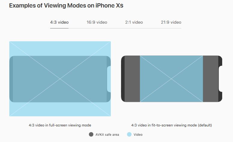
It is important that the designer knows how the video will be cropped based on the chosen viewing mode, as if it is cropped too much then information from the video cannot be seen by the user on the display. It is also important to keep videos at their original aspect ratio otherwise it may appear stretched out or squished to fit the frame/template of the viewing mode.
Accessibility and Languages
It is also important to think about how accessible the app is to everyone. Can a blind or deaf person use this app? Is there software which is included in the app which enables them to use it? Apps which cater for a lot of people will have added support in its software which may read out the information displayed on screen, or have subtitles for audio or videos which can be played. Having an app which is able to be used by everyone will not only increase the amount of people who will download the app, but also make those who need this additional support feel included.

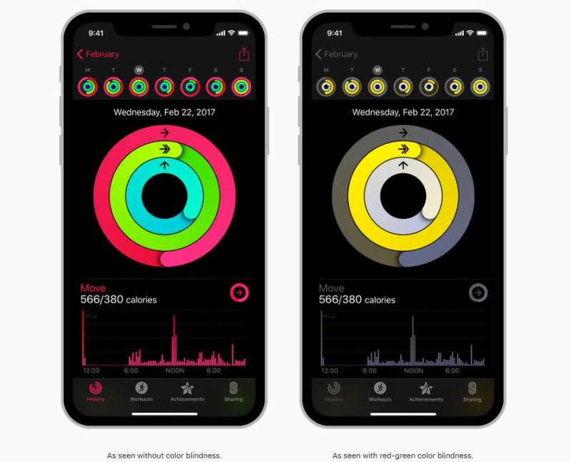
Accessibility can also relate to the colour scheme of an app, as Apple is aware that colourblind people may require different colour schemes to make their apps more easier to use. Languages additionally relates to the colour scheme of an app, as red can mean danger in some countries or it can be positive for others. Having appropriate colours for an app is important as to not offend anyone.
Having multiple language options for an app is important so that it can be used across the world. An app which is in English will limit its users to those who can only speak English. An app with multiple language options will branch out its amount of users.
What is Apple’s Privacy Policy and Terms of Service when you are working with them?
Apple’s terms of service says that an app which uses an Apple license is considered an “Apple app” and an app which uses an app provider’s license is called a “third-party app”. For those who want to design an app and become merchants on their App Store, there are some terms and conditions such as:
- The app provider of any third-party app is solely responsible for its “content, warranties and claims”
- The app provider is also responsible for maintaining and updating the support of their app if it is third-party
The privacy policy for someone who is designing an app for an Apple product is the same as that of a customer’s privacy policy. This includes terms and conditions such as:
- The personal information is collected to improve Apple products and to keep the user updated with the latest news of products, announcements and software updates
- Personal information can be used to send important notices such as changes to terms and conditions or policies, or disputes about purchases
- Information may be collected from customer’s activities on Apple’s website or other services to improve the relevance of search results on those services
A restriction when working with Apple could be that they are not responsible for updating the app you have created. This could be irritating for the app designer as when Apple chooses to update their own software or release a new product, the app designer may have to rewrite their software and update it so that it is optimised for the new update or product.
What is a GUI?
A GUI is a Graphical User Interface, which is a way of presenting information to the user in a way that makes the information the easiest to understand, navigate and interact with.
GUIs are important to use when designing an app (or in this case, an interactive map) as their sole purpose is so the user can understand and utilise it. Without a GUI, a lot of software including OS, interactive maps, websites, apps, and more would be difficult and frustrating to navigate – the user would not know what to do or how to use the software, and so it would be less intuitive.
The GUI for an app
The benefit of having a GUI in place is so that a user, no matter what their background knowledge is in technology, can use the software confidently. The software is simple and straight-forward, with clear menus and obvious places on where to tap or click next. They give “instant feedback” to the user, which means that if something is tapped or clicked on then the software will react instantly. This is a benefit of a GUI as when compared to a command-line interface, it is more user-friendly. A command-line interface will require the user to enter something in and then pressing return, which when the input is invalid, will give no results. A GUI in comparison does not require this from the user and simply needs a tap to provide results.

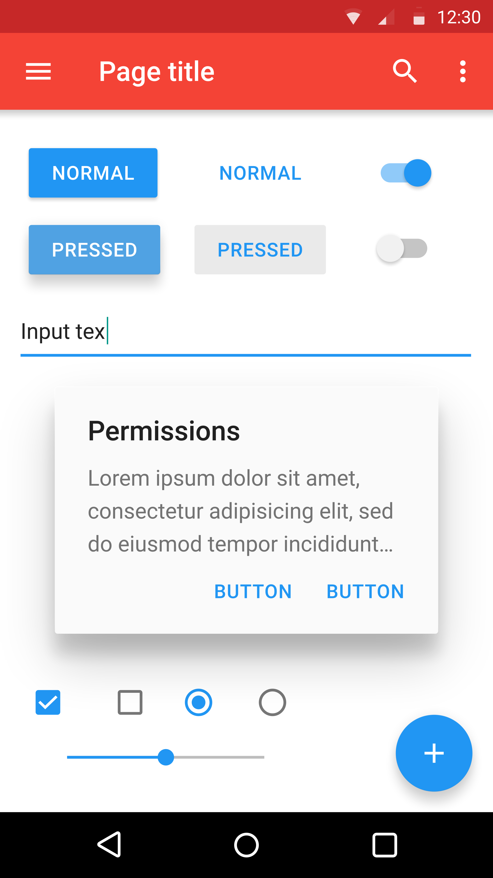
An example of a GUI. Here we can see clickable icons, which will take the user to a page relating to what they have clicked on. The icons help to describe the text below, which shows the user what pressing on the icon can relate to. The sidebar displays links if the user prefers not to use the icons, which are categorised using categories and sub-categories which drop down once the user clicks on them.

An example of a command-line interface
An example of a GUI is an interactive map, where the user can tap on an icon which will then instantly tell the user how to get there based on their location, or more information about the place they have tapped on. An example of a command-line interface is using safe-mode on start-up of a computer, where the user has to type something in and press enter before the interface does anything as a reaction. If the result has no valid results, it could also end up with displaying nothing.
A disadvantage to using a GUI is that it requires more graphical information rather than text-based. This can lead to the software which is using the GUI to require a lot more processing power than something simple like a text-based UI.
The first use of a GUI was in an Apple Lisa computer, which is interesting as Apple is recognised today for having a very sleek GUI which is very user-friendly for devices such as their iPhone, iPad and Smart Watch.

Susan Kare
Susan Kare is an artist and graphical designer, most known for her work with Apple during the 1980s, specifically on the Macintosh. After Steve Jobs left Apple in 1985, he created a company called NeXT which, much like Apple, specialised in computers and software. Susan Kare also became creative director of NeXT, working with clients like IBM and Microsoft.

Kare specialises in pixel art and icons, creating art for companies such as Facebook, PayPal and of course, Apple. She has also made logos, book illustrations, presentation slides and more for a multitude of other companies. Kare is a very notable contemporary American graphic designer, with an impressive portfolio of work including:
- Designs for the card deck for Windows 3.0 solitaire
- The elements (including icons) for the interface of the Apple Macintosh
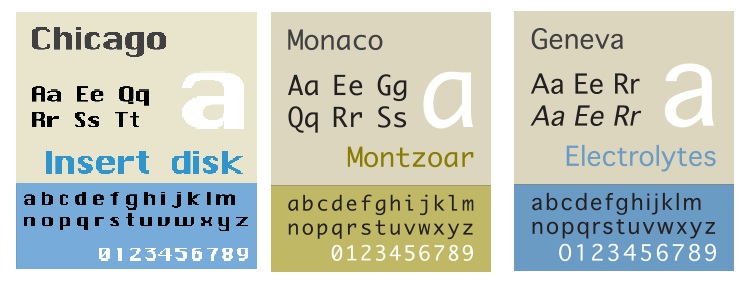
- Typefaces such as Chicago, Geneva and Monaco

Kare said “It’s fun to read that, before there was social media, countless people spent hours with Microsoft Windows Solitaire using the cards I designed”
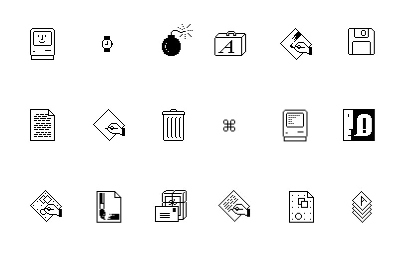
Kare designed many typefaces and icons for Apple during the 1980s. To this day, revised and improved versions based off of the icons she created are still used. Notable icons she had created are the lasso and paint bucket tool, which still look fairly similar to how she had originally designed them
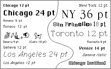
The famous fonts Chicago, Monaco and Geneva are all designed by Kare
Chicago was Kare’s most successful typeface. It was applied to the Classic Mac OS interface as well as the first four generations of the iPod interface
Alongside the typefaces, some other very recognisable icon designs by Kare are the Happy Mac icon, which is displayed on screen during startup and the command key for Apple keyboards.

These all show off her work and expertise in designing and creating icons and graphics. Her graphics are straight-forward and effective with the user being able to understand what action they may perform. At Kare’s job interview for Apple, she brought her own notebook filled with icons which she had designed for the company’s OS and software. It was a grid-notebook, where each square represented one pixel which she would fill in with pink marker.

The “Happy Mac” (welcome screen) and “brush” icon

The “cut” and “paste” icons
Seeing Kare’s work with the notebook and pink marker reminds me of how vector graphics are still relevant today. They are useful for icons as they can be scaled up or down without the loss of information. According to Kare herself, icons should be as efficient as a road sign, rather than detailed illustration. This is because they are made to serve a purpose and get a direct message across. Users can easily get confused if an icon is too complex with a lot of colour and details.
What makes good interactive design?
- The audience understands the message of it
- It is simple, easy to understand and easy to use
- It attracts positive attention
- It is effective and efficient in what it does
- There is no clutter, it is clean with generous space
- It is not noisy or too complex
- It enables the user, it is not meant to be an obstacle but rather helps them
- No more than two typefaces are used (generally)
- One thing is aligned to another, it involves mathematics in its design which makes it pleasing to the eye
- The colours are not too loud but not too dull – they are harmonious with each other
The difference between a typeface and a font
As typography, typefaces and fonts have all been mentioned before, it is important to be able to tell the difference between the three. Typography is the art and creation of a typeface/font, it is the “visual component of the written word”. A typeface is all styles and variations of a certain type, such as Arial or Helvetica. A font is one specific style or version of a typeface, such as Arial Bold or Helvetica Italic.
 Sophie Cabble
One thought on “Task 1 Research (Blog)”